The Art of the Perfect Monochrome Outfit
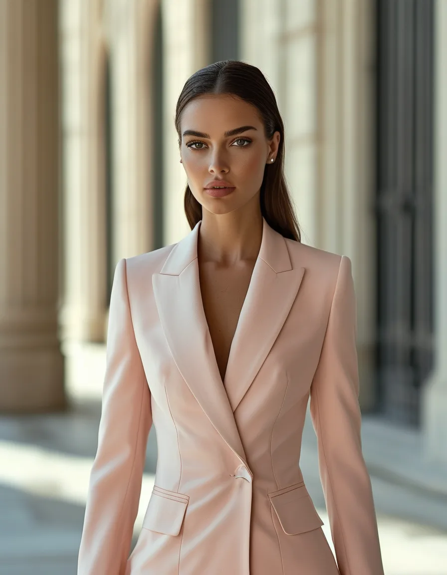
Quick Answer: A monochrome outfit works because a single unbroken color creates one long vertical line, which reads as both taller and more deliberate. Choose tonal (2-3 shades of one color) over exact-match if you want the more wearable version, and mix at least two textures — knit against leather, matte against satin — so the look has depth instead of reading flat.
One color, head to toe. It’s the fastest way to look like you thought about your outfit, and it takes less thought than almost anything else.
The catch is that monochrome has exactly one failure mode, and it’s a real one: done carelessly it goes flat, and flat reads as costume. Here’s how to avoid that.

Why Does Monochrome Look So Expensive?
Because of what your eye does with an uninterrupted line.
Normally an outfit gives the eye places to stop — the waistband, the hem, the color change at the shoulder. Each of those horizontal breaks visually shortens the body and adds a small amount of busyness.
Remove them and the eye travels top to bottom without pausing. The result reads longer, leaner, and more composed, which is why it’s a permanent fixture in fashion editorial and street style photography.
There’s a second, quieter reason: a single color is a decision. It communicates that someone chose this, rather than assembled it from whatever was clean. That’s most of what “expensive-looking” means in practice.
Tonal or Exact-Match: Which Should You Choose?
Both work. They just do different jobs.
Exact-match — the same shade in every piece — is high drama. It’s the strongest version of the effect and the most striking in photos. It also requires the pieces to genuinely match, which is harder than it sounds, since two blacks from different brands are frequently two different colors.
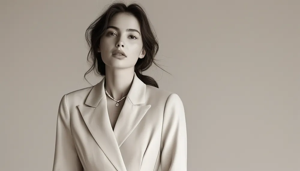
Tonal — two or three shades within one color family — is the more wearable route and honestly the better default. Camel with cream with tan; navy with slate with pale blue. The gradation gives the eye something to follow while keeping the unbroken line intact.
A useful rule: keep tonal within about three shades of each other. Wider than that and it stops reading as one color and starts reading as an ordinary two-color outfit.
Exact-match is easiest in black, white, and true neutrals. Tonal is easier in everything else.

Why Does Texture Matter So Much?
Because texture is doing the job color usually does.
In a multi-color outfit, the color changes create interest. Strip that out and you need something else to keep the eye engaged — otherwise you get a flat silhouette that looks like a uniform.
Pair at least two contrasting surfaces:
- Knit against smooth — a chunky sweater with satin trousers
- Matte against shine — wool with leather, or crepe with silk
- Structured against fluid — a stiff blazer over a bias skirt
- Sheer against opaque — a fine layer over something solid
Three textures is the sweet spot for most outfits. The finish contrast is doing more work than the shade contrast — a single beige in three different fabrics looks richer than three beiges in the same fabric.
Accessories count too. A woven bag, a suede boot, or a metallic belt all add surface variety without breaking the color line.
5 Mistakes Everyone Makes With Monochrome
1. Assuming all blacks match. They don’t. Warm black, cool black, faded black, and true black sit differently side by side, and daylight is unforgiving. Check pieces together in natural light before committing.
2. Using one fabric throughout. Same color plus same texture equals flat, every time. This is the mistake that makes monochrome look like workwear.
3. Picking a color that doesn’t suit you. You’re wearing a lot of it, with nothing to break it up near your face. If a shade is borderline in a small dose, it will be decidedly not-borderline head to toe.
4. Breaking the line with a contrast belt or shoe. A bright belt cuts the vertical exactly where you least want it. Keep hardware and accessories within the color family, or go deliberately metallic.
5. Forgetting shoes and bag exist. They’re roughly a third of the visual field. A black outfit with brown boots is a two-color outfit with extra steps.
The first one catches nearly everyone at some point, and it’s why so many all-black outfits look slightly off without anyone being able to say why.
Which Color Should You Choose?
Start with what’s already true. Look at what you own in quantity — that’s usually a color you’re drawn to and that works on you.
Neutrals are the easiest entry: black, camel, cream, grey, navy. They’re forgiving on shade-matching and they’re what most wardrobes already contain in multiples.
For color, the ones that tend to read most sophisticated head to toe are deep green, burgundy, chocolate brown, and rust — colors with enough depth that a full-body dose doesn’t overwhelm. If you want the monochrome effect in something lighter, keep it tonal rather than exact-match so there’s built-in variation.
And use the elongating effect deliberately. If you want maximum height, keep shoes within the color family too — the line runs all the way to the floor, and a matching shoe adds a visible inch or two to the impression.
Mini FAQ
Does a monochrome outfit have to be exactly the same color?
No — tonal dressing with two or three shades of one color is often more wearable and more interesting than an exact match. Keep the shades within about three steps of each other so the outfit still reads as one color.
How do you keep a monochrome outfit from looking boring?
Texture. Combine at least two contrasting surfaces — knit with satin, matte with leather, structured with fluid. Texture supplies the visual interest that color normally would.
What’s the most flattering color for monochrome dressing?
Whichever one suits your coloring, since you’re wearing it near your face in volume. Camel, navy, black, deep green, and chocolate brown are the most reliably sophisticated across skin tones.
TL;DR:
- Monochrome works by removing horizontal breaks, creating one long, elongating vertical line.
- Tonal (2-3 shades of one color) is more wearable; exact-match is more dramatic.
- Mix at least two textures — this is what prevents flatness, not shade variation.
- Not all blacks match; check pieces together in daylight before wearing.
- Keep shoes and accessories in the color family so the line runs all the way down.
One color, three textures, shoes included. That’s the whole formula — and it’s one of the chicest outfits in any wardrobe.
Keep Reading
This article is for general styling and informational purposes only. Trends, sizing, availability and pricing may vary by brand and season.